
Ask for the space
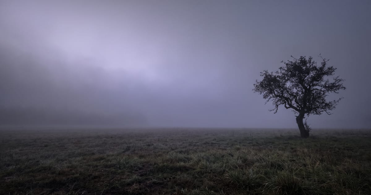
Models fill the frame by default. Say where you want room: "the subject on the right third, the left half empty with a soft plain background".
Where text goes
- Website hero: left or centre, depending on your layout.
- Blog cover: one side, away from the subject.
- Vertical ad: top and bottom, the subject in the middle.
Keep the space calm
Empty space works when it is calm: sky, a wall, a soft blur. A busy background behind text makes it hard to read, whatever font you use.
Name what fills the space
Asking for "empty space" often gets you a model that fills it anyway, because it has nothing to put there. Name the calm thing that should be there instead: "a pale evening sky", "a plain warm grey wall", "still water". The model can draw a sky; it cannot draw nothing.
Two examples of room that works
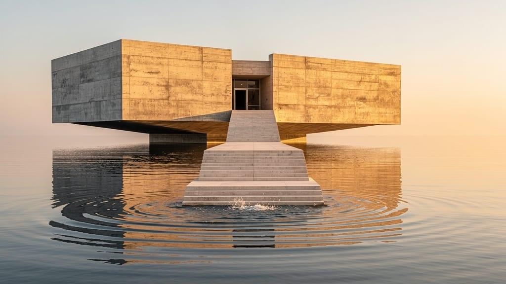
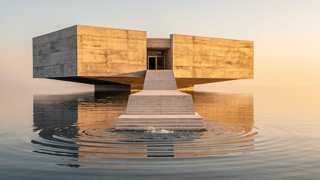
A museum floating over a calm sea at golden hour: the building sits in the middle, the sky above it is soft and even, and the water below is still. A headline fits in the sky, a button in the water, and neither fights the building.
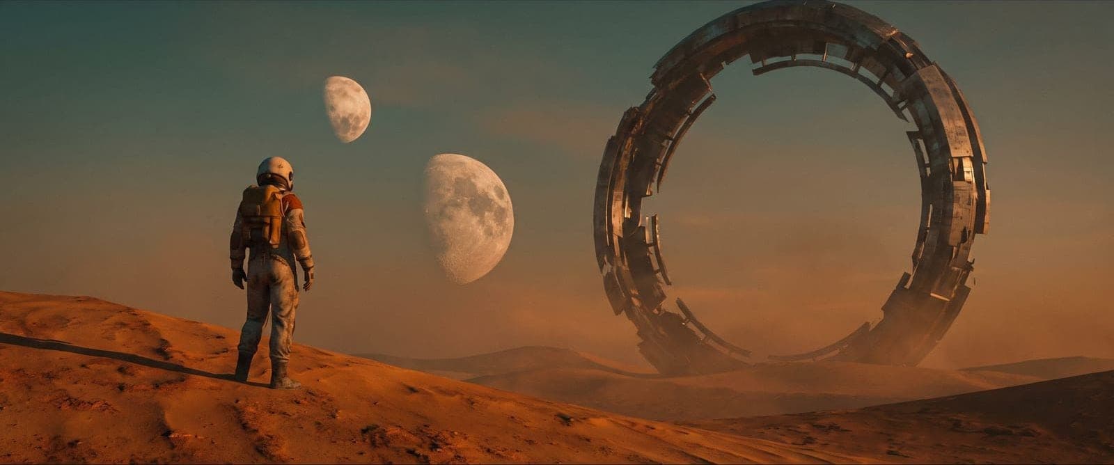
An astronaut on a dune on the left third, looking towards two moons and a ruin on the right. The subject looks into the frame, so the eye follows the gaze. For text, you would keep the subject and ask for a plainer sky on the other side.
Place the subject on a third
Split the frame into three columns and three rows. Put the subject on one of the lines, and the text on the opposite side. Turn the subject towards the space: a person looking into the empty half pulls the eye towards your headline, while a person looking out of the frame pulls it away.
Example prompts per layout
Each one says where the subject is, what fills the rest, and where the light comes from.
- Website hero, 16:9: "A ceramic vase with dried flowers on the right third of a light oak sideboard, the left half a plain warm white wall, soft window light from the right."
- Blog cover, 16:9: "A cyclist on a coastal road on the left third, seen from behind, the right side open sea and pale sky."
- Vertical ad, 9:16: "A bottle of olive oil in the middle of the frame on a stone table, plain soft blue sky above, the table surface below, room at top and bottom."
Presets that make calm space
The Editorial style preset adds "considered composition, restrained styling and generous negative space", which is exactly the look of a page with room for words. f/1.8 shallow dissolves the background into a soft blur, and the Product photo preset puts the subject on a plain studio backdrop. Pick one style preset; they are one choice per category.
Room in a video
A clip with text over it needs the same calm area, and it has to stay calm for the whole clip. Ask for movement away from the text side: a slow dolly in on a subject on the right, with a still sky on the left. A camera that pans across the frame moves the busy part right under your words.
Make it in the Studio
Choose Set it up yourself, write the placement in the first sentence of the prompt, and set the shape before you run: Widescreen 16:9 for a hero, Vertical 9:16 for a story ad. Make a few and open them in the Library to compare. The one with the calmest free area wins, even if another has the nicer subject.
Too tight? Expand it
If the picture is right but the subject fills the frame, do not start over. The Expand image tool widens a picture beyond its edges in the shape you pick, with no prompt. Expand a square photo to 16:9 and you gain room on both sides; crop from the side you do not need.
Check it with the real text
Place your actual headline on the image in your editor, at the size it will have on the page, before you call it done. Text that looked fine in your head may cover a face or sit on the one busy patch. Light text needs a dark calm area, dark text a light one.
Mistakes with space
- The subject too small: room for text, but nothing to look at.
- Space on the wrong side for your layout. Check where your site puts the headline before you make the image.
- A pattern or texture in the empty area: brick, leaves, a crowd.
- Writing "blank" for the area. Name a calm surface instead.
Questions
Should the model write the text?
Usually no. Add text in your editor so it is exactly right.
Which shape for a hero?
16:9 or wider, depending on your site.
How much of the frame should be free?
Enough for your headline at its real size, with a margin around it. For a website hero, often a third to half of the width. Measure it on your own layout once, then ask for the same split every time, so a series of heroes lines up.
Does every model follow a request for space?
Most follow a clear placement, such as "on the right third, the left half a plain wall". Some fill the frame regardless. If one keeps doing that, try another model, or make the image and widen it with the Expand image tool.
Read next

Put this guide to work
Open the studio and try what you just read. You start with 1,000 free credits.
Get early access