
Text that actually reads
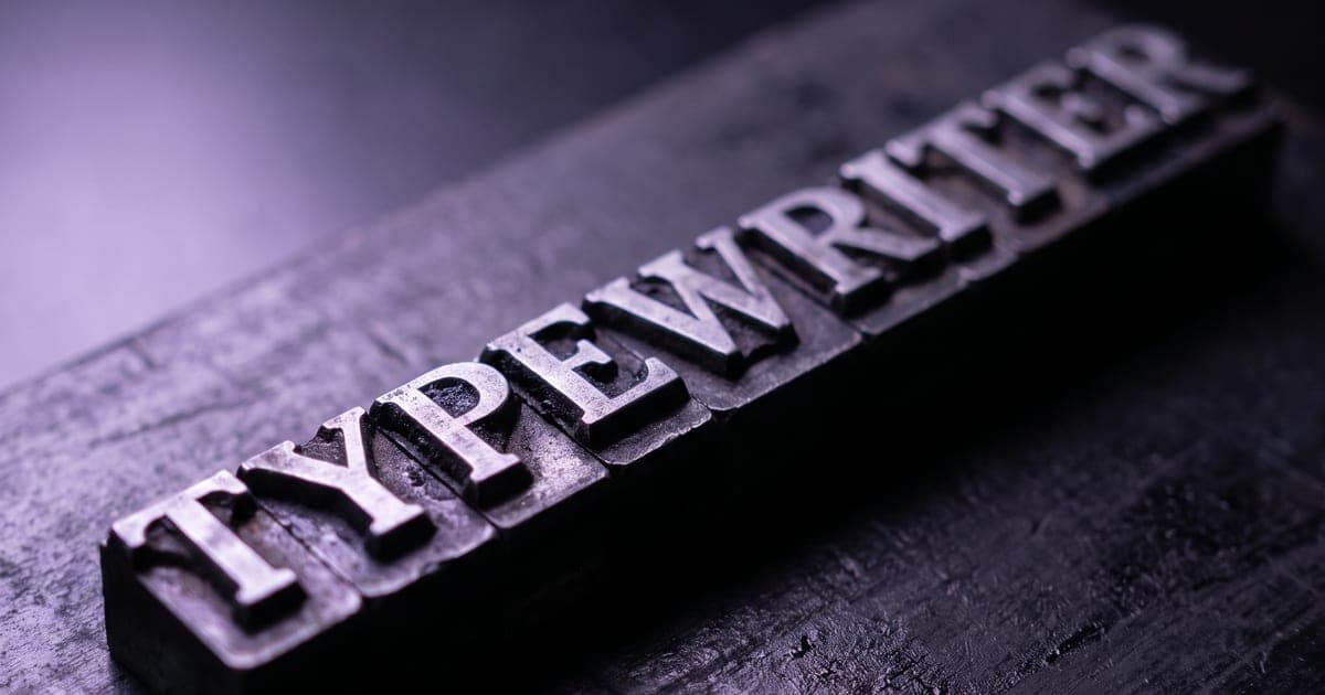
Most image models approximate letter shapes. A few set real type, and that decides which one you pick.
1 min read · last checked
Why letters are the hard part
An image model learns what text looks like, not what it says. That is enough for a sign in the far background and nowhere near enough for a poster, a packaging mock-up or an infographic, where a single wrong letter makes the whole image unusable.
A handful of models are built for this and say so in their own documentation. On those, the spelling holds, the spacing is even, and a headline stays a headline instead of becoming a shape that resembles one.
Ask for the words in quotes
Write the exact string you want, in quotes, and say where it sits. "A printed poster reading OPENING NIGHT in large clean sans-serif, with Thursday, 8pm in smaller type beneath it" gives the model a target it can hit or miss visibly.
Keep it short. A paragraph of body copy is not a realistic ask on any of these; a headline and one supporting line is.
Check the result at full size, not in the thumbnail. Letter errors survive a small preview and jump out the moment someone opens it.
The model pages say which ones can
Each model page lists what the maker claims and what we measured while curating it. The ones built for type say so on their own page; the ones that are not do not pretend otherwise, because a claim nobody checked is worse than no claim.
Read next
Put this guide to work
The studio opens in stages. We let people in in the order they signed up, and you start with 1,000 free credits.
Get early access