

Ideogram
by Ideogram
Posters, logos and readable type, and precise edits that keep the rest intact.
What it is
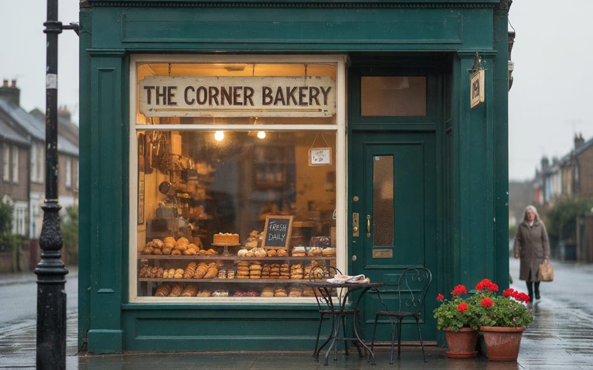
Ideogram 4.5 is built to "generate posters, logos, and designs with accurate typography", in three quality tiers, low, medium and high, where "price does not depend on size".
That commercial framing is the point. Where most image models are built to make a picture, this one is built to make a thing that gets printed or posted, which means the type has to be right, the composition has to hold at a glance, and the result has to survive being put in front of somebody who is paying for it.
Its edit endpoint takes "a source image and a prompt, plus up to 4 reference images", with a high-precision mode "which uses Precise Edit and restores unchanged pixels". In this studio the family also powers the tool that widens an image beyond its edges, which still runs on Ideogram V3.
What it is good at
Accurate typography is its stated purpose. Headlines, logos and captions that do not need to be fixed afterwards.
Change a word on a sign or a colour on a label, and the pixels you did not mention stay exactly as they were.
You pay for the quality tier, not the format. A tall poster and a square post cost the same.
The same family reframes an existing image to a new shape without a prompt. The Expand an image tool runs on it.
Where it struggles
- Ideogram publishes no list of limitations, so there is none here.
- The default tier is medium. If a result is close but not quite there, moving to high is the first thing to try, not a longer prompt. High costs several times medium, and the Studio shows it.
- Masked edits are not offered in the Studio yet. Describe the change in words instead.
How to prompt it
Say what the piece is, then what is on it. "A poster for X" gives it a format to compose into. Put any wording in quotes exactly as it should appear, and name the hierarchy, what is large, what is small, what sits where.
An example that shows what that means
A minimal gig poster for a jazz trio: the words "BLUE ROOM" in heavy condensed capitals across the upper third, a grainy monochrome photograph of a double bass filling the centre, and three lines of small type at the base. Deep navy background, one warm accent, generous margins.
What we offer here
Straight from the catalogue, so this list never goes stale. The price is the provider’s published rate with our markup on top, and it is on the button before you run anything.
Questions
Which tier should I pick?
Medium is the default and handles most work. Low is for volume, high is for the version that ships. The amount is on the button before you run.
How good is it at text?
Typography is its stated strength and one of the main reasons to choose it. For very long text or many languages, GPT Image 2 and Seedream 5 are the other two to try.
What happened to Ideogram V3?
Ideogram 4.5 replaced it for making images. Flows you built with V3 open with 4.5. The Expand an image tool keeps using V3, because 4.5 does not reframe.
Next
Sources
Try Ideogram in the studio
The studio opens in stages. We let people in in the order they signed up, and you start with 1,000 free credits.
Get early access